Info

History of Icons

Idea, design and creation

FUTURAMO ®, futuramo.com
MODULUS, modulus.eu
With 20 years of experience, leading large projects, consulting top brands
and generally defining what design and the Webplatform can accomplish
together, we see ourselves as “quite grown-up”, a bit less “start-up” :-)
Being a relatively small (20+ person) company we comprise of great talent
from many fields. Together we are united in a vision for what we think
should be – no less – than the next form of computing.

Join us! Contributing to the
“History of Icons” project

If you have any interesting photos or screenshots,
which show icons in old operating systems, please share!

Special thanks to

Marcin Wichary, guidebookgallery.org
Nathan Lineback, toastytech.com
for sharing archive photos and screenshots for our project!

We would love to hear from you!

Please, drop us a line if you would like to:

  • give us any comments or suggestions
  • report an error and suggest corrections
  • share your ideas
  • join our team or cooperate with us
  • become our client, partner or investor
  • say “hello!” and tell us how we’re doing

Contact

Please, email us: contact@futuramo.com

History of Icons

A visual brief on icon history
through different graphical user interfaces
in different operating systems

irix - bin icon
beos - clock icon
android - camera icon

Did you realize that...
computers weren’t born
with a graphical user
interface?
It happened after
over 30 years
of computers
being in use!

Along with this revolutionary
concept came another
brilliant idea of using icons
in computing.
Yes. “A picture
says more than a thousand
words”.

the

80s

The 80s belong
to the ancestors

They were black and white, as proper “old folks” should be. Flat and already sitting self-confident in their grids (well... most of them). Their “ desktop metaphor” has stayed with us up till today! The outline took its toll on icon fashion, ruling for 20 years. Hard to believe, but some of these signs kept the same form from the 1st day of their lives...

When the grandparents were born

First pixels for signs

1981

Dr David Smith,
a mathematician
and Norm Cox, an artist united the powers of two, seemingly completely unrelated disciplines.

Invented by Smith, designed by Cox, it presented a square grid, simple looks, consistent style.

1983

Named after Steve Jobs'
daughter, Lisa was the
first personal computer
with a graphical user
interface aimed at a wide
audience of business
customers.

Lisa was a major project during that time and gathered almost one hundred people working on the design.

1984

Probably the most famous “art + programming marriage” happened in ‘82. For creating icons, Apple hired Susan Kare, a step they should never ever regret.

The kids were a lovely bunch of consistent siblings. You can freely say: pixel art in the purest form

1985

Something went a bit off the road when these were being prepared. Is there a grid? Well, yes. But it's hard to see.

Sometimes it's hard to see what they really mean, too... We shouldn’t be too harsh though. Beginnings are often bumpy.

1985

They start to gain some volume. Office drawers jump out of the screen, files multiply and the trash bin swells.

TOS introduces the new trend. What spacious desktops we will have from now on!

1985

Ladies and gentlemen, let us present: user customization! Amiga provides an interface with fully editable icons (meaning four colors and few sizes available).

We all know it’s a lot of fun to personalize our devices. But “user freestyle” doesn’t always end up as a coherent design...

1986

Even in the times when fashion was dictated more by technical abilities, strong individualism occurred. Some tried their own, different way.

So, why not color the outline instead?

1998

Apple didn’t give a full hand, they only gave one finger. As many as 15 colors available but it was ONLY colors.

Still enough to have the eager user playing with “folder painting” for some time.

1989

NeXTSTEP was founded by Steve Jobs. It was something new... With shaded and highly detailed icons it showed us an entirely new approach to icon design.

NeXSTEP icons were the first ones to be considered skeuomorphic. It’s obvious that a new era of icon design has begun!

First lessons learned, conclusions drawn. Colors and three simple dimensions put their roots down for good. A constant stream of technical improvements supports the evolution. Basic signs are overgrown with shadows and shades. Files, computers, pencils and trash bins toss and turn at different angles. Icons begin to climb the long stairs,

to the Dream
World of Realism.

90s

the

Microsoft did their homework. We feel the grid, and it’s easy to see the icons come from one production line. Probably thanks to the very same Susan Kare, an icon in the icon design world.

1990

Started with 16 colors The next versions, both Windows and OS/2, show a slow and steady evolution.

1991

With shades of grey and delicate accents, they present a less intrusive palette. Thanks to this all, the signs make a coherent package.

It takes more time for Mac to make the icons show their sides, but over time, they become convinced, and most of them turn isometric.

While everybody followed the basic trends, Geoworks shows a slight breakaway from the outline fashion. Images proudly shine with indigo edges.

1993

The rest of the shades are matched, too, and the overall effect is vibrant and unique. Shame it’s only some of the icons. Apparently, consistency is still a hard nut to crack.

1997

Keeping the mainstream core idea, BeOS icons represent a somewhat different look.

Apparently, it’s enough to slightly differ the angle and close each of them in a cube. And Voila! Original style despite the technical bonds.

The icons rise into the air. Everybody pushes it to the limit to add the illusion of space.

1998

While struggling to make them float, IRIX forgot to get rid of the dots... BUT despite the rash, they have a very important feature: They are vectors.

A patchwork bridge between the centuries

When the new still can’t get through

1999

A change is brewing... Something just pushes out of them, but can’t really get past the steely border of the outline.

The new invention of
a transparency mask
mixed with isometry and perspective provides an icon salad of a hundred tastes.

1999

It’s hard to be an icon in times of the revolution...

The new century is soon to arrive, and they seem to shiver and be a bit shudder, dropping pixel-crumbs all around.

2000s

the

New millennium
realistic boom

and a “literal” craze reaches its peak. Finally, they made it! It all looks like real! What’s more - it’s hyper polished, spick-and-span and tip top. Shiny, blinky, glossy. Transparent, multi-layered, multi-shaded. Blurred and softened. It’s all “bigger, better, and MORE”.

2001

“Photo-illustrative icon style” smashes the idea of an icon being just a symbol. Aliasing is passé, so the edges can freely blur.

The pictures grow huge, have alpha channels and 8-bit transparency masks. What a splendor!

mac os x - bin full icon
mac os x - finder icon
mac os x - applications icon
mac os x - disc globe icon

Not so literally, but still striking. Here it seems that icons hit the Effects Jackpot.

2001

Each of them created as a vector gets its beauty days in Photoshop later. Dressed up and with heavy make-up, they hit the desktop runway, spinning in all directions.

2007

windows vista - bin icon

Probably the most important representative of the “Icon Rococo Style”. Reached an enormous size and deserves a “Detail Master” degree.

windows vista - note icon
windows vista - folder icon
windows vista - computer icon

We’re now so proud to have a whole collection of glittering pieces on our glossy screens.

ios - note icon
ios - camera icon

Once we got the bug, it spread easily through our global village.

2007

ios - mail icon
ios - mail icon

The whole world strives to reproduce... the world. Apple with its IOS allows us to carry the semi-realistic little pictures with us everywhere we go.

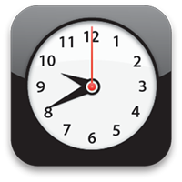
ios - clock icon
ios - clock icon

2008

android - calendar icon
android - clock icon

Google rushed to summon a couple of friends (including, among many others, HTC, LG, Motorola and Samsung).

An Open Handset Alliance was born with Android as the main operating system. Since then, we have all lived our mobile lives with the life-mimicking icons.

android - phone icon
android - camera icon

the

2010s

After the deadly race, the exhausted Icons seemed to come to their senses. They start a journey back in time to discover their roots and their real meaning. They slowly undress out of their costumes and reveal their natural shapes. The realistic era is over. Once again in the history

it appears that
less is more.

A bold look to the past

New flat mono color!

2010

Microsoft made a revolutionary move releasing Windows Phone 7. Out of the blue, the icons became flat. They also went white and received a uniform background.

A serious makeover that opened the gates to new design paths.

windows phone 7 - phone icon
windows phone 7 - settings icon
windows phone 7 - mail icon
windows phone 7 - message icon

Mobile apps fuelled the icon design industry. Despite the technical abilities, “flatenization” seems to take over.

2013

apps web - document icon
apps web - folder icon
apps web - clock icon
apps web - bin icon

Gradients and shadows are still lingering, but they have a rather shy nature in these plain circumstances.

communication envelope-open-empty (message open)
office-supplies-and-equipment calculator
futuramo

A timeless system

After over 30 years of experimentation, learning from the mistakes of others’ and our own, experienced on the battlefield of creating icons, there came a brilliant system. Combining science and art, FUTURAMO Icons provide an esthetic design, incredible consistency for ALL the signs, along with almost unlimited flexibility. What is crafted you adjust, no more room for mistakes. As simple as three clicks.

time, mouse-and-cursors hourglass
technology floppy-disk (save)
time, mouse-and-cursors hourglass

The dreams of countless users finally came true

Icons of the new era balance the needs, constraints and possibilities of today
office-supplies-and-equipment calculator
files document-text
files document-text
time clock
time clock

2015

technology computer
technology computer
files document-text-pencil-diagonal

Universality. Files and calendars, smileys and animals. For each sign, you’ll find millions of possibilities. FUTURAMO Icons are just fantastically adjustable. Colors, styles, formats, sizes. Whatever is needed.

communication envelope-open-empty
office-supplies-and-equipment drawer-with-files
communication speech-bubble-text

Easy to use. Click or tap and they will all follow. It takes seconds. The system is clear and intuitive, a pure pleasure to use it.

technology floppy-disk
people user-star
people user-star
interface-and-formatting, science color-picker
medicine-and-health, science laboratory-test-tube-fumes
objects-and-equipment cup
toys-and-games teddy-bear-smiling
signs-and-symbols award-badge

Thousands of signs. Since 2007, the icon base has been continuously growing and doesn’t plan to stop. Because we follow our strict principles, the new arrivals always match the previous ones!

arrows arrows-cross-right-02
sound-and-music bell-ringing-03
communication, toys-and-games kite
communication phone-receiver-call
business-and-finance shopping-cart-with-goods
interface-and-formatting shield-with-check-mark
warnings-and-alerts bomb
transportation, sport-and-fitness bicycle
communication transmitter-03
interface-and-formatting, halloween magic-wand
animals bug
animals bug
animals mouse-02
animals mouse-02
food-and-drink cheese
emotions-and-feelings emoticon-bangs-grin
objects-and-equipment, furniture washing-machine

Aesthetics. It’s not only about tech stuff. They are simply pretty! Matching any project you pick. Go on and give them a try :-)